
I Judge Restaurants By Their Menus Before I Taste The Food. And So Does Everyone Else.
Why your first impression is costing you more than you think, and what a beach restaurant in Greece, this summer, taught me about brand identity.
We were starving.
It was a hot afternoon on a Greek beach,in the Olympic Region. The kind of a day where the sun sits heavy and all you want is cold water, shade, and something fresh from the sea. We spotted a restaurant right on the waterfront. The location was perfect. The tables had a view. We sat down.
Then the server handed us the menu.
And my stomach sank a little.
Not because of the prices. Not because of anything the server said. Just… the menu. It was old, the kind of laminated thing that's been through a hundred summers. The layout was chaotic. Categories blurred into each other. There were tiny images dotted throughout that were too small to tell me anything useful. I wanted seafood, I was craving it, but I couldn't find it. Everything was jumbled together, no clear hierarchy, no logical flow, no sections. The server's English made it hard to ask questions, so I was essentially guessing. So lost + hungry, not a great combo.
I ordered shrimp almost by accident. It was the one thing I could identify with confidence.
And then the food arrived.
It was exceptional. Genuinely, surprisingly, delicious. The shrimp were fresh and perfectly cooked. Everything else we ordered was the same. Very well prepared, well presented, clearly made with care and love. It was one of the best meals of the trip.
But here's the thing I couldn't stop thinking about afterwards.
How many people walked past that restaurant without going in?
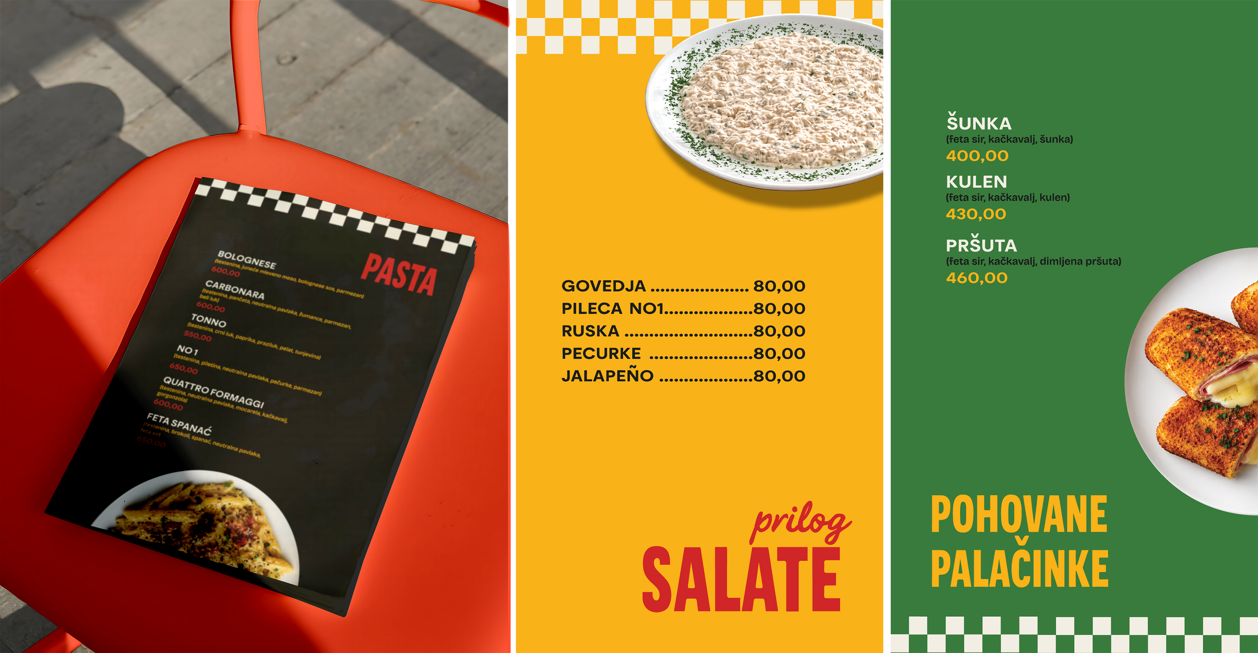
“Menu Design For A Belgrade Based Fast Food Restaurant, 2026. | IsidoraSara Design”
How many glanced at the menu displayed outside, the same chaotic, worn-out menu we held in our hands, and kept walking? How many sat down, felt that same quiet doubt I felt, and ordered the safest, most recognisable thing on the menu instead of the dish they actually wanted? How many left underwhelmed not because the food failed them, but because their expectations were already so low that nothing could feel like a real win?
The kitchen was doing everything right. The brand was quietly undoing it.
And here's the detail that stuck with me most when I thought about it later.
The restaurant was full. Packed, actually. But almost entirely with locals.
People who already knew. People who had been coming for years, who didn't need the menu to tell them anything because their own experience had already told them everything. They weren't reading signals, cause they had the data.
On the other hand, the tourists, the people walking past on the beach path, glancing at the menu displayed outside, making a split-second decision about where to spend their money, were going elsewhere. To the places with the nicer menus, the cleaner signage, the more confident first impression.
The brand wasn't just failing to attract new customers. It was actively filtering them out. Selecting for the loyal locals who would come regardless, and repelling everyone else before they ever sat down and tried the actual food.
Which sounds fine, until you think about what that means for growth. For revenue on a slow week. For what happens when your loyal regulars aren't enough.
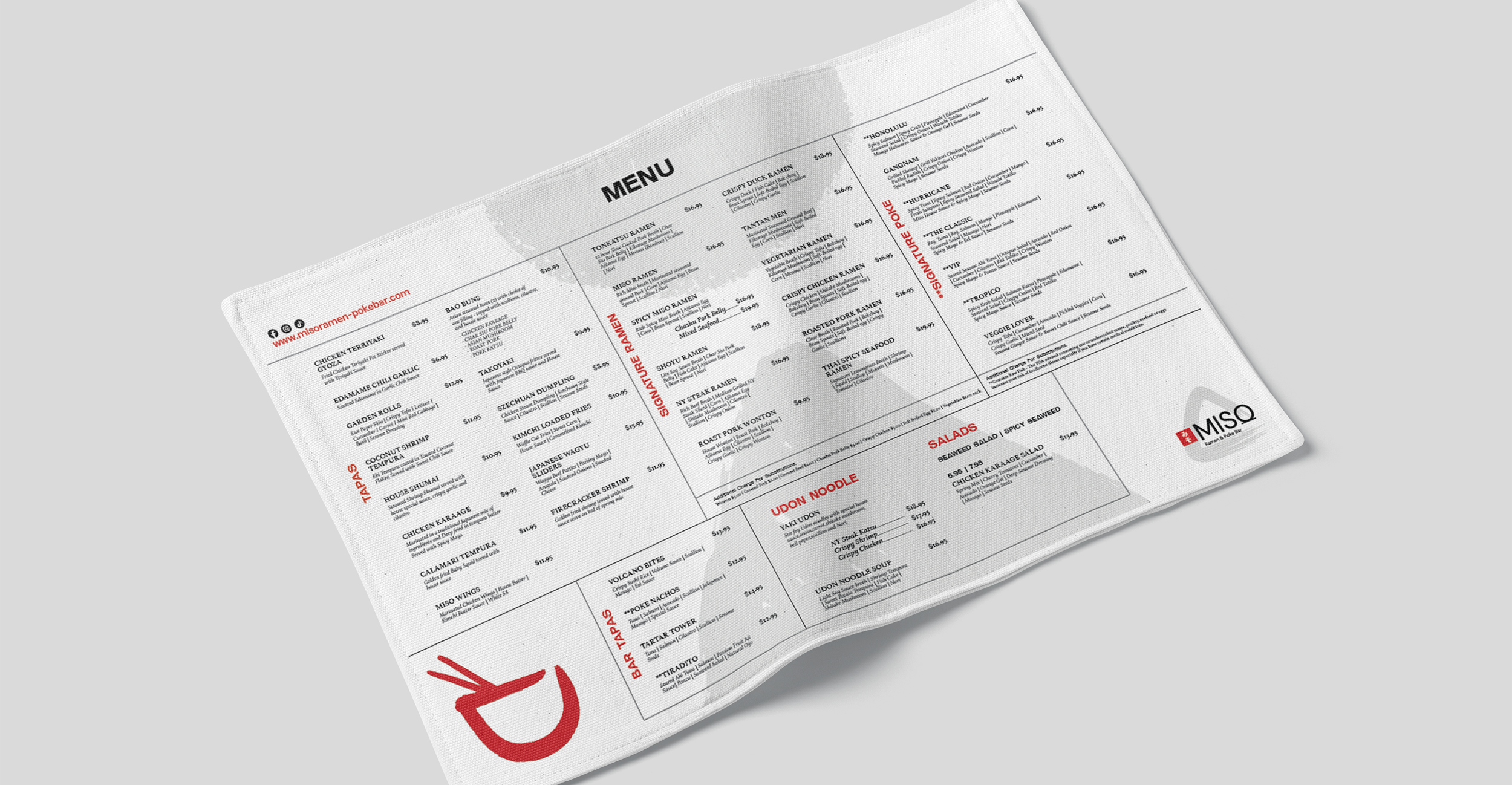
“Menu Design For A USA Based Ramen Restaurant, 2025. | IsidoraSara Design”
Why A Menu Is Never Just A Menu
When you pick up a menu in a restaurant you've never been to, you're not just looking at a list of food. You're reading signals. Your brain is processing information faster than you're consciously aware of, making dozens of micro-decisions about what kind of place this is, what quality of food to expect, and whether the price you're about to pay is going to feel worth it.
The weight of the paper.
The quality of the print.
Whether the font is readable or requires squinting.
How easy it is to find what you're looking for.
Whether the categories make sense.
Whether the descriptions make you hungry or just inform you.
Whether the whole thing feels considered or thrown together.
All of this happens in seconds. Before you've read a single dish. Before you've tasted anything.
And it sets the ceiling for your entire experience.
If the menu is chaotic and cheap-feeling, you walk in already slightly disappointed. The food has to work twice as hard to overcome that first impression. And even when it does, as it did for me in Greece, you're left thinking "surprisingly good" rather than "exceptional." Because your baseline was low.
Flip it around. Walk into a restaurant with a beautifully designed menu. Heavy stock, clean layout, typography that feels intentional, descriptions that make your mouth water. You sit down already excited. Already trusting. Already in a generous mood. The food doesn't have to be extraordinary to feel extraordinary, it just has to meet the expectation the menu already set.
Same kitchen. Different experience. Because of a piece of paper.
What Your Menu Is Actually Communicating
Let me break down exactly what I noticed about that Greek restaurant menu, and what each element was silently saying to me as a customer.
“The material quality”
The laminated, worn menu said: we haven't updated this in years. We're not particularly invested in how things look. We're here, we'll feed you, but don't expect us to go out of our way.
A menu printed on quality card stock, replaced regularly, says something completely different: we care about details. We take pride in the experience, not just the food. We think you're worth the investment.
Neither of these impressions came from the food. They came from a piece of paper.
“The layout and navigation”
When I couldn't find the seafood section easily, my brain registered confusion. And confusion creates doubt. If they can't organise their menu clearly, can they organise their kitchen? Is this place actually good or am I about to waste money on a mediocre meal?
A well-structured menu with clear categories, logical flow, easy to navigate, communicates competence. It says: we know what we're doing. We've thought about your experience. You're in good hands.
“The imagery”
The tiny, poorly printed images scattered throughout did more harm than good. They implied that the restaurant wanted to show off their food but couldn't quite pull it off. Blurry or small food photography is almost always worse than no food photography.
Either invest in imagery that makes people hungry, or let the words do the work. There's no in-between that works.
“The descriptions”
I couldn't tell from the menu what I'd actually get with each dish. Portion size, preparation style, key ingredients. That uncertainty made me order conservatively. I went for the thing I could most easily visualise.
How many more adventurous, higher-value dishes did I skip because the descriptions didn't give me enough confidence to order them?
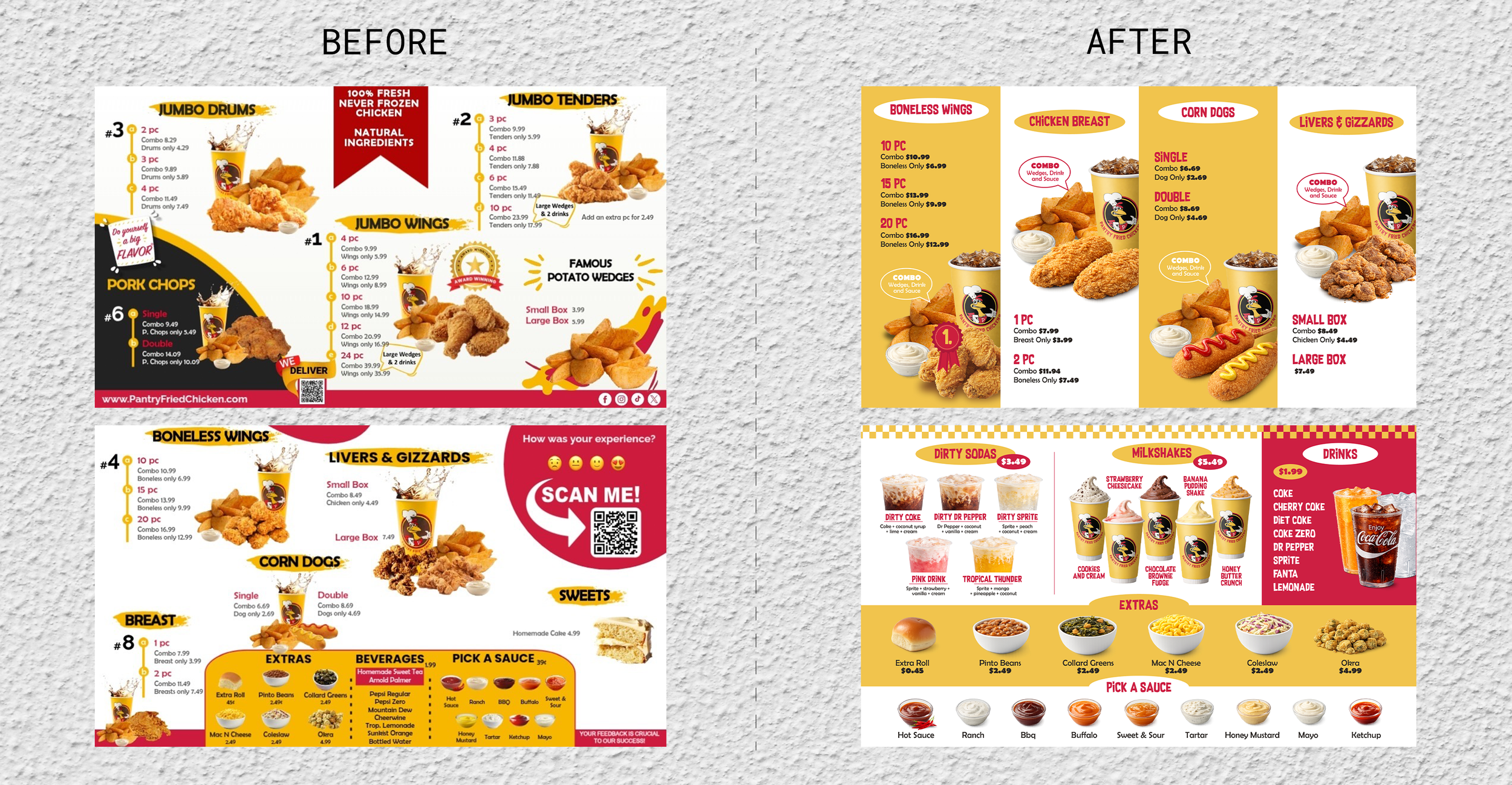
“Menu Design For A USA Based Chicken Fast Food Restaurant, 2026. | IsidoraSara Design”
This Is Not About Restaurants
Here's where I'm going to ask you to think about your own business.
Because everything I just described about that menu, the first impression, the signals it sends, the ceiling it sets on the customer's experience. All of it applies to every single brand touchpoint you have.
Your website is the menu.
Your Instagram is the menu.
Your packaging is the menu.
Your business card, your email signature, your proposal document, all of it is the menu. All of it is being read before anyone has tasted your food. Before anyone has experienced your service, your product, your expertise.
And just like that Greek restaurant, you might be exceptional at what you actually do. Your product might be genuinely outstanding. Your service might be the best in your space.
But here's the part that should make every founder uncomfortable. That restaurant was full of loyal locals. People who already knew how good it was. And that probably felt fine, maybe even good, on a busy afternoon with every table taken.
But those locals weren't finding them through Instagram. They weren't landing on their website and deciding to book. They weren't telling their tourist friends "you have to go, look how beautiful their brand is." They were returning because of personal experience built over years.
New customers, the ones who don't already know you, who are encountering your brand cold for the first time, they are making decisions based entirely on what your brand communicates before they've experienced anything. And if your brand is sending the wrong signals, they're self-selecting out before you ever get the chance to prove them wrong.
You're not just losing customers. You're filtering them. Keeping the ones who already know you and repelling everyone else.
That works until it doesn't. Until the loyal base isn't enough. Until you want to grow beyond the people who found you before your brand reflected what you actually are.
If your brand is sending the wrong signals before anyone gets that far, if it feels chaotic, inconsistent, cheap, or unclear, you are setting a low ceiling on how people experience everything that follows.
You're making your best work harder to see.
The Questions Worth Sitting With
When someone encounters your brand for the first time, whether that’s your website, your social media, your packaging, whatever the first touchpoint is, what are they silently concluding?
Does it communicate quality before they've read a word?
Is it easy to understand what you do and who it's for?
Does it make them feel like they're in good hands?
Does it set a ceiling that your actual product or service has to fight to overcome? Or does it set an expectation that makes everything that follows feel like a natural confirmation of something they already sensed?
The restaurant in Greece had exceptional food. I know that because I sat down and ordered. But I almost didn't. And plenty of people didn't.
Your brand is either opening that door or quietly closing it.
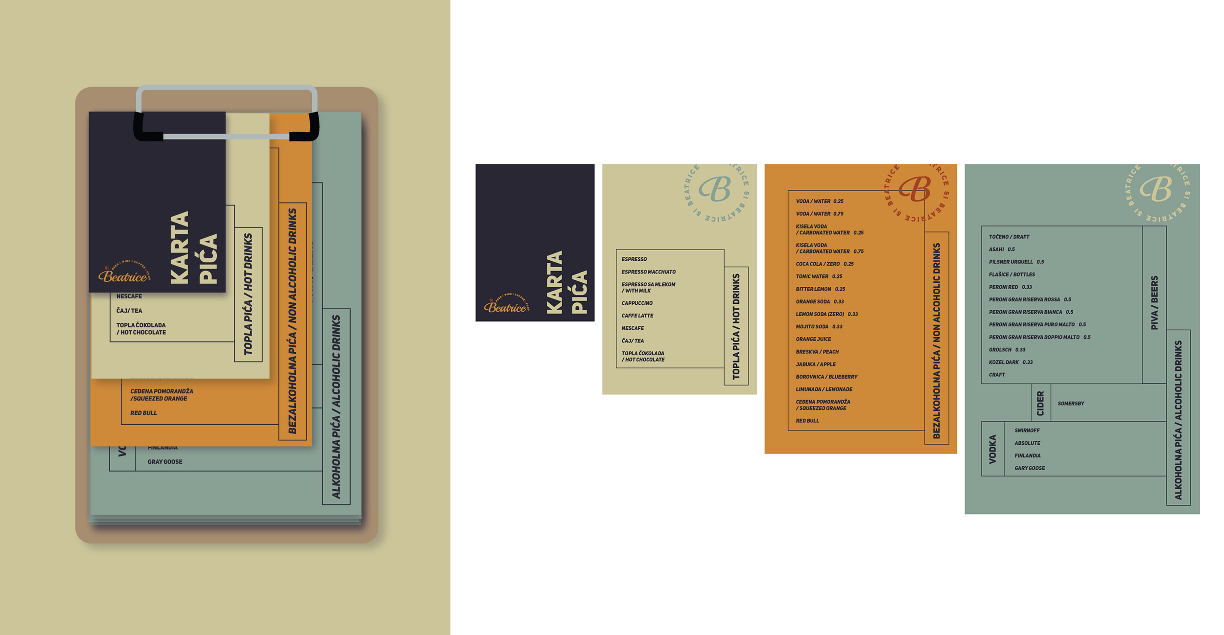
“Menu Design For A Belgrade Based Bar&Cafe, 2023. | IsidoraSara Design”
What Good Brand Identity Actually Does
It doesn't just make your business look better. It makes every impression count. Before anyone has experienced what you actually do.
It sets the right ceiling. It builds trust before trust has been earned through experience. It makes the right people feel like they're in exactly the right place, and it makes the wrong people self-select out before either of you wastes time.
A beautifully designed menu in a mediocre restaurant is misleading. But a beautifully designed brand identity for a business that's genuinely excellent? That's just giving people the right information upfront.
Your product deserves to be judged on its merits. Not on the first impression your brand creates before anyone gets there.
If reading this made you think about your own brand, that's probably worth paying attention to. Get in touch and let's talk about what your first impression is actually saying.